Waterfall visualization
This article applies to the following Customer Insights roles: Developer
The waterfall visualization is designed to show how a set of values – some positive, some negative – combine to result in a final total. As such, the waterfall visualization is typically used with financial data: the chart might illustrate how revenue (new sales, renewals, services) combines with expenses (payroll, building maintenance, taxes) to produce the net return for an organization.
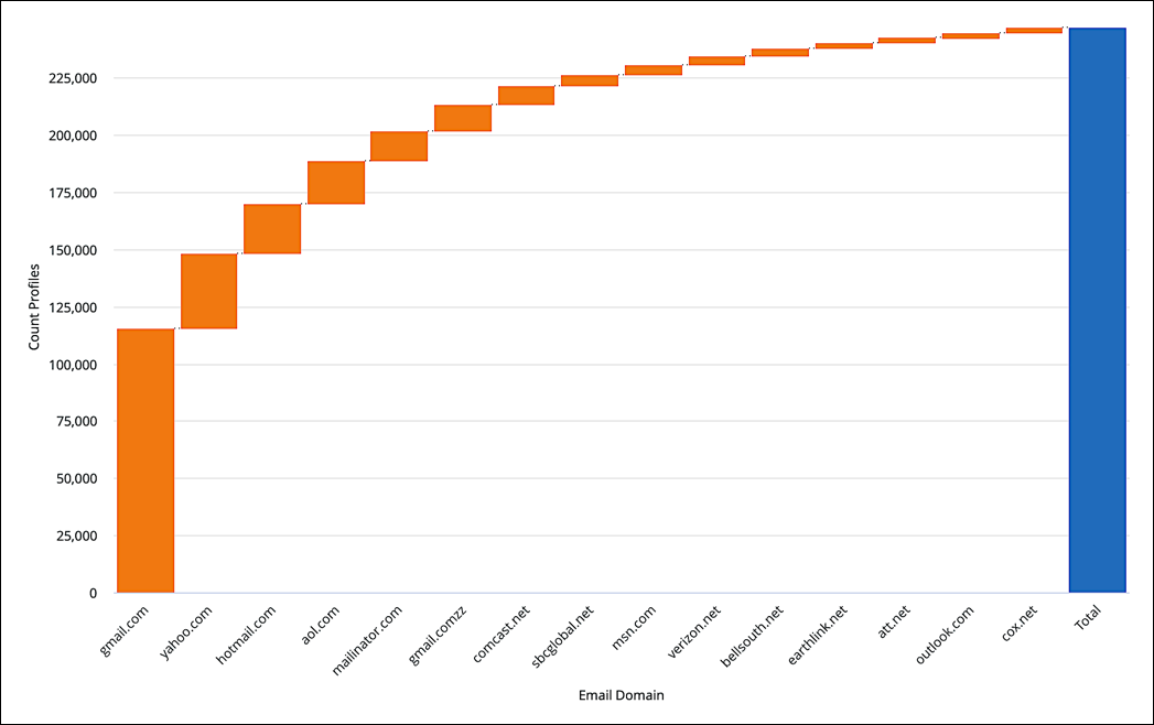
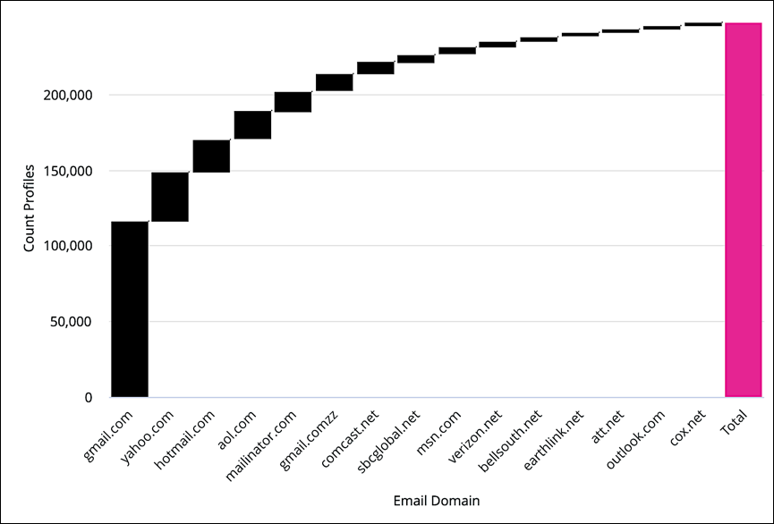
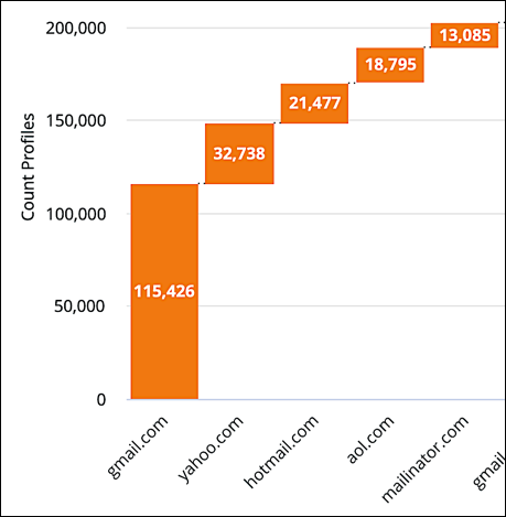
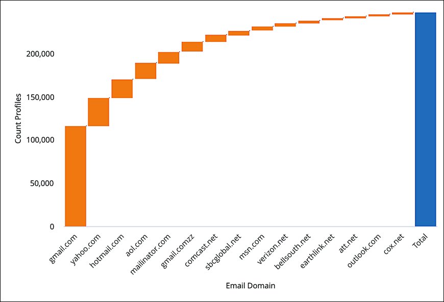
Based on all that, there's no doubt that the waterfall chart probably isn't the most-relevant visualization for most Identity Cloud data. However, that doesn’t mean you can’t ever use the waterfall visualization. For example, the following waterfall chart shows the relative contribution of different email domain providers to your total user base:

As you can see, gmail.com is by far the most-commonly used email domain, with other domains (such as yahoo.com, hotmail.com, and yahoo.com) making successively smaller contributions to the overall user base.
Customizing the visualization
To customize the waterfall visualization (change colors, change the number format, format the X or Y axis, etc.), click Edit to display the parameters menu:

Each of the tabs on this menu, and each configuration option found on these tabs, is detailed in the next few sections of this documentation.
The Series tab
Configuration options that apply to the entire visualization include the following:
Color Configuration: Collection
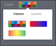
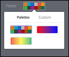
The Collection dropdown lets you choose from a themed group of color palettes. For example, if you leave the Collection set to Akamai Colors and then click Palette, you’ll see the following set of predefined color palettes:
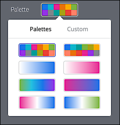
This set of palettes is very different from what you see if you set Collection to Shoreline and then click Palette:
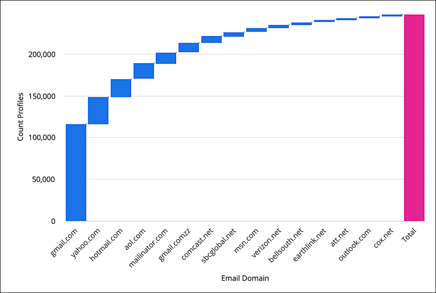
Incidentally, if you do select Shoreline your visualization colors will instantly update. For example:
Palette
As noted in the previous section, clicking Palette displays the color sets that have been predefined for that collection:
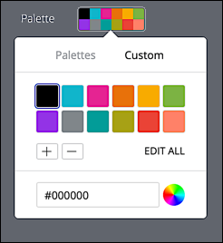
However, you might notice that the Palette dropdown also includes a tab labeled Custom. If you click the Custom tab, you can change any of the values found on the currently selected palette. For example, here we’ve changed the blue color to black, something we can do by clicking the blue square in the palette and then entering a new color code to replace the blue (in this example, we entered #000000, the hex code for black; we could also enter the color name black):
In turn, the blue columns in our visualization are recolored accordingly:
Reverse colors
Directly beneath the palette shown on the Style tab is a checkbox labeled Reverse colors:
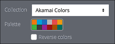
If you look at the palette, you’ll see that the first color square in the palette is orange; it’s no coincidence that orange is also the color assigned to the individual columns (except the total column):

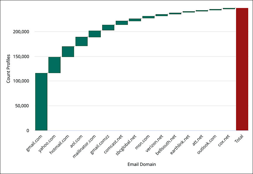
You might also have noticed that the last square in the palette is colored dark green. If you select Reverse color? the last color in the palette (dark green) swaps places with the first color in the palette (orange). In addition, the second color swaps places with the second-to-last color, the third color swaps places with the third-to-last color, and so on. By the time all this color swapping is over, your visualization will end up looking like this:
Up Color, Down Color, and Total Color
The following options enable you to assign specific colors to the visualization elements:
- Up Color. Determines the color of positive elements.
- Down Color. Determines the color of negative elements.
- Total Color. Determines the color of the Total column.
For example, here we’ve clicked the Up Color setting and then selected a green shade:
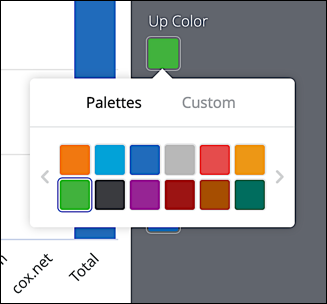
This colors all positive values green.
The Values tab
Configuration options for displaying individual data points include the following:
Value Labels
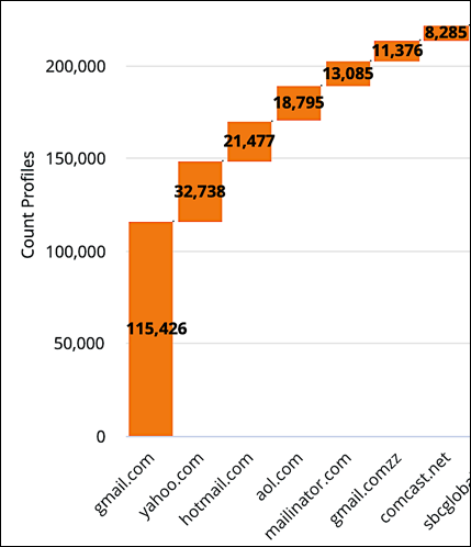
When set to On, values (e.g., 115,426) are displayed on top of each visualization item:
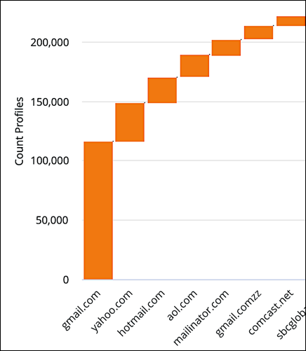
When set to Off value labels are not displayed:
Value Colors
Determines the color of the value labels (if displayed). When configuring value label colors you can enter either a standard color name (e.g., pink) or the corresponding hex color code (#FFC0CB). For example, here the value color has been set to white:
The X tab
Configuration options for the X (horizontal) axis include the following:
Scale Type
Determines how the X axis is configured and displayed. Allowed values are:
-
Automatic Based on Data. Customer Insights analyzes the underlying data and sets the X axis scale based on the data types.
-
Ordinal. The X axis is scaled to show evenly-spaced data points, regardless of the relative distance between those points.
-
Time. The X axis is plotted using datetime values. This option is available only if the underlying data is datetime-based.
Show Axis Name
When set to On, the name of the axis (in this case, Email Domain) is displayed at the bottom of the visualization:

If set to Off the axis name is not displayed.
Axis Value Labels
When set to On, the axis labels (e.g. gmail.com) are displayed on the X axis:
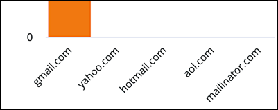
When set to Off, labels are not displayed:

The Y tab
Configuration options for the Y (vertical) axis include the following:
Show Axis Names
When set to On the axis name (Count of Profiles) is displayed on the Y axis:
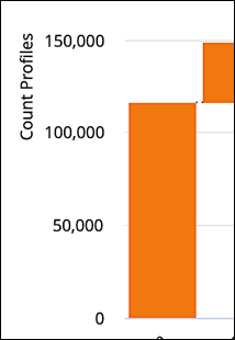
Whet set to Off the axis name is not displayed.
Axis Value Labels
When set to On, value labels (for example, 150,000) are displayed on the Y axis:

When set to Off those label are not displayed:
Gridlines
When set to On horizontal gridlines are shown on the visualization:

When set to Off those gridlines are hidden
Updated 20 days ago
