Customer Insights glossary
This article applies to the following Customer Insights roles: Viewer; Developer
Considering all the things that you can do with Customer Insights, you'll likely be amazed at how easy the product is to use. In fact, the hardest thing about learning your way around Customer Insights lies mainly in learning a few terms - Looks, Explores, Spaces - that are unique to the product.
And just how hard will that be? Well, if you take a moment to peruse the following terminology guide, not very hard at all. In this section of the documentation we’ll briefly define and explain:
- Folders
- Perspectives
- Dashboards
- Looks
- Explores
- Visualizations
- Filters
- Queries
Folders
Folders are roughly equivalent to the file folders used in a computer’s file system: folders are there to store, and to help organize, other things. In the case of a Customer Insights folder, those other things are Dashboards and Looks. By default, anyone logging on to Customer Insights has access to three folders:
-
Shared, a folder where you’ll find Dashboards and Looks that have been made available to everyone in your organization or everyone is a specified group.
-
A personal folder named after you. (For example, if your name is Bob Jones you’ll see a folder named Bob Jones' folder.)
-
People (which, technically, is where your personal folder is actually stored). If other users grant you access to their personal spaces, you can access those spaces from the People space as well.
Depending on your access permissions, you might be able to create additional spaces within your personal space. How do you know if you have the necessary access permissions? The easiest way to find out is to open your space and see if there’s a New button:
If there is, then you can create a new folder (or a new Dashboard):
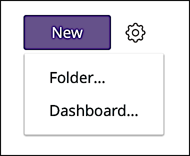
If there’s not, then you can’t.
Perspectives
At first glance, perspectives seem to be just another name for folders; after all, both perspectives and folders are shown on the Browse menu, and both perspectives and folders provide links to Dashboards and Looks. So then what's the difference between the two? The primary difference is that perspectives are strictly for navigational purposes: they provide links to Dashboards and Looks, but you cannot create and store Dashboards and Looks in a perspective.
Dashboards
If you know what a car dashboard is then you have a pretty good idea what a Customer Insights Dashboard is as well. In a car, a dashboard serves two purposes: it provides you with information at your fingertips (how fast are you going, how many miles have you traveled, how much gas do you have left in the tank), and also provides controls for interacting with the car (you can change the radio station, you can turn down the air conditioning, you can enter a new destination into the navigational system). Do you have to reach into the backset to turn on the radio or to check the oil pressure? Of course not: all those things are found on the dashboard.
Customer Insights Dashboards perform similar functions. Information at your fingertips? One of the primary purposes of Dashboards is to provide “one-stop shopping” for your information needs. For example, look at all the different visualizations (and all the different types of information) found on a typical Dashboard:

Profiles by email provider, profiles by gender, profiles by age, profiles by country - they’re all there.
Customer Insights Dashboards generally have an interactive element as well. For example, that preceding Dashboard includes a number of filters that let you manipulate the data displayed on the Dashboard:
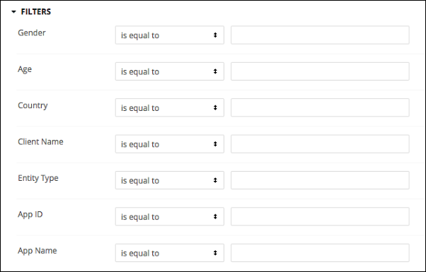
Want to view data just for users who listed male as their preferred gender? Then do it, and notice how the visualizations change:
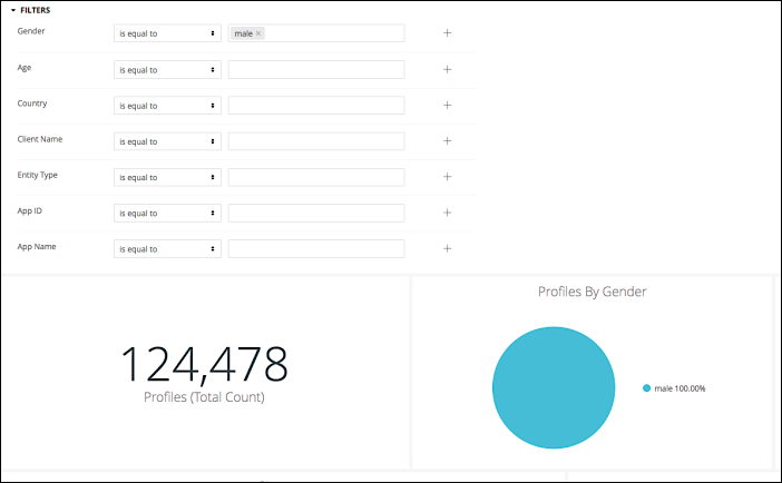
Just one of the many cool capabilities built into Customer Insights dashboards.
Looks
If a Customer Insights Dashboard is similar to a car dashboard, then a Look is similar to one of the gauges found on that dashboard. In a car, there will be a number of gauges, most of which do one thing: the oil pressure gauge tells you the oil pressure; the fuel gauge tells you how much gas is left in your gas tank; the temperature gauge tells you the current engine temperature.
Looks perform a similar function. On a Dashboard you might have a Look that returns information about user demographics; a second Look that reports information about registration and sign-in events; and a third Look that tells you which web browsers are being used to access your site. Like a gauge, each Look performs a single task, but combining multiple Looks (gauges) on a Dashboard can provide a way to monitor your entire site.
Oh, and remember that cool Dashboard we showed you a moment ago:
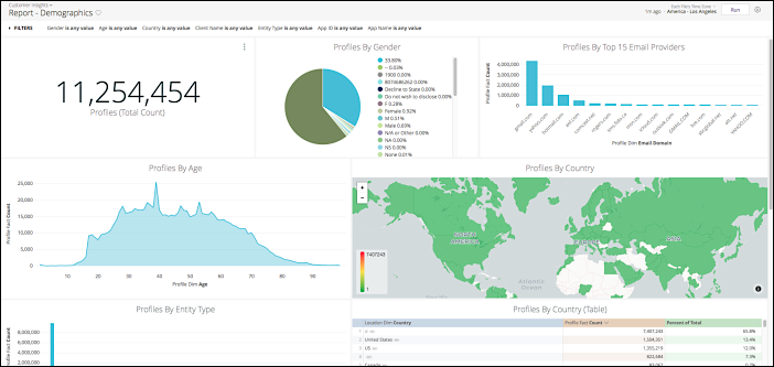
Each little section of that Dashboard, each chart and graph (i.e., each visualization) is actually a Look. Looks retrieve and display data; Dashboards are just a way to gather a bunch of different looks in a single place.
There’s also one other difference between Looks and gauges. If you remove a gauge from a Dashboard that gauge won’t be of much use: a speedometer pretty much has to be installed in a Dashboard in order to report useful information. That isn’t true of Looks, however: Looks do not have to be included in a Dashboard (a standalone Look returns the same information as a Look found on a Dashboard). Like we said, Dashboards are just a convenient way to organize multiple (and typically similar) Looks.
Explores
In Customer Insights, an Explore is really another name for a database table. For example, one of the default tables included with Customer Insights is named App Dim. As it turns out, App Dim is derived from a database table named app_dim. The following table shows the relationship between the fields found in App Dim and the fields found in app_dim:
| App Dim | app_dim |
|---|---|
| App ID | app_id |
| App Name | capture_app_name |
| Entity Type | entity_type |
Is it important that you know that App Dim is - for the most part - just a more user-friendly version of the table app_dim? No, not really. However, if you have experience working with databases, knowing that Explores are just database tables might make it a little easier to understand what you really doing when you use these Explores to create Looks.
Although, as you’ll soon find out, Explores are pretty easy to understand regardless.
Visualizations
Visualizations are the charts and graphs (as well as tables and text messages and maps and ….) used to display the data returned by a Look or an Explore. Note that all Looks and all Explores must include a visualization. If you don’t specifically choose a visualization, a default visualization (typically the column chart) will be selected for you.
Filters
Filters enable you to zero in on the data that’s most important (and most useful) to you at any given time. For example, suppose you have a dataset that shows all the different web browsers used to access your site:

That’s a useful dataset, although it does contain 38,152,403 records (!). That’s a lot of records, especially if you’re only interested in Android browsers. Of course, if you wanted to, you could meticulously comb your way through all the records, looking only for those records where the Browser is equal to Android. In theory, and given enough time, that would work.
However, a better approach might be to create a filter that does the very same thing:

When you run this query, you’ll get back a very different dataset, albeit one that still has 512,106 records in it:

That’s a little better, and that’s what filters are for: they help make your datasets more manageable.
Ah, but wait: there’s more. Suppose you aren’t interested in Android browsers in general, but only in Android browsers used on mobile devices. Do you have to wade through all 500,000+ records to find that data? No. Instead, you can add a second filter to further target the returned data:

Now we get back this dataset, which contains 93,317 records:

And if you’re only interested in Android 5.x mobile browsers, well, just add another query:

Now we get back 5 records:

That’s what filters are for.
Queries
Admittedly, you won’t see the word query very often when working with Customer Insights; in fact, you probably won’t see it at all. However, you will see that term used throughout this documentation. For example, consider the following note from the Creating Looks topic, where the term query appears no less than 5 times:

When the documentation refers to a query or running a query, it’s invariably referring to what happens when you first access a Dashboard or Look, or what happens when you click the Run button. Although Customers Insights doesn’t use the term, under the covers the product is creating and running often-times complex SQL queries:
SELECT * FROM (
SELECT *, DENSE_RANK() OVER (ORDER BY z___min_rank) as z___pivot_row_rank, RANK() OVER (PARTITION BY z__pivot_col_rank ORDER BY z___min_rank) as z__pivot_col_ordering FROM (
SELECT *, MIN(z___rank) OVER (PARTITION BY "event_fact.time_stamp_minute") as z___min_rank FROM (
SELECT *, RANK() OVER (ORDER BY "event_fact.time_stamp_minute" DESC, z__pivot_col_rank) AS z___rank FROM (
SELECT *, DENSE_RANK() OVER (ORDER BY "event_fact.event_type" NULLS LAST) AS z__pivot_col_rank FROM (
SELECT
    TO_CHAR(DATE_TRUNC('minute', CONVERT_TIMEZONE('UTC', 'America/Los_Angeles', (timestamp 'epoch' + event_fact.time_stamp  * interval '1 second'))), 'YYYY-MM-DD HH24:MI') AS "event_fact.time_stamp_minute",
    event_fact.event_type  AS "event_fact.event_type",
   COUNT(*) AS "event_fact.count"
FROM janrain.event_fact  AS event_fact
LEFT JOIN janrain.app_dim  AS app_dim ON event_fact.app_id = app_dim.app_id
WHERE ((((event_fact.time_stamp ) >= ((DATE_PART(epoch, CONVERT_TIMEZONE('America/Los_Angeles', 'UTC', DATEADD(minute,-59, DATE_TRUNC('minute', CONVERT_TIMEZONE('UTC', 'America/Los_Angeles', GETDATE())) )))::bigint)) AND (event_fact.time_stamp ) < ((DATE_PART(epoch, CONVERT_TIMEZONE('America/Los_Angeles', 'UTC', DATEADD(minute,60, DATEADD(minute,-59, DATE_TRUNC('minute', CONVERT_TIMEZONE('UTC', 'America/Los_Angeles', GETDATE())) ) )))::bigint))))) AND (((CASE WHEN '' = 'y'
    THEN MD5(app_dim.capture_app_id)
    ELSE
    app_dim.capture_app_id
    END) LIKE '%'))
GROUP BY DATE_TRUNC('minute', CONVERT_TIMEZONE('UTC', 'America/Los_Angeles', (timestamp 'epoch' + event_fact.time_stamp * interval '1 second'))),2) ww
) bb WHERE z__pivot_co_rank <= 16384
) aa
) xx
) zz
WHERE z___pivot_row_rank <= 500 OR z__pivot_col_ordering = 1 ORDER BY z___pivot_row_rank
And don’t worry: you won’t have to write these kind of queries yourself. Again, it just helps to know what happens when you do something in Customer Insights. When you use the point-and-click interface to create an Explore, you’re actually writing a SQL query like the one shown above. And when you click the Run button, you’re actually executing that SQL query. And when you read about queries in the documentation, well, now you’ll know exactly what we’re talking about.
Updated 24 days ago
