Line visualization
This article applies to the following Customer Insights roles: Developer

Displays information as a series of data points connected by lines. Line charts are typically used to illustrate data trends over time; for example, you might compare the number of new registrations over the past year with the number of account deactivations.
In this article:
- Customizing the Visualization
- The Plot Tab
- The Series Tab
- The Values Tab
- The X Tab
- The Y Tab
Customizing the visualization
To customize the line chart visualization (change colors, change the number format, change the axis label, etc.), click Edit to display the parameters menu:

Each of the tabs on this menu, and each configuration option found on these tabs, is detailed in the next few sections of this documentation.
The Plot tab
Configuration options for the entire visualization.
Series Positioning
Determines how values are displayed in a chart that has multiple data series. Allowed values are:
-
Overlay. Series are individually plotted on the chart:

-
Stacked. Series are cumulatively plotted on the chart:

-
Stacked Percentage. Series values are displayed as percentages, with all values adding up to 100%.
Line Interpolation
Specifies how lines are drawn on the chart. Allowed values are:
- Linear. Straight lines are used to connect points.
- Monotone. Curved lines are used to connect points.
- Step (center). Points are connected by steps, with the data point located in the middle of the step.
- Step (before). Points are connected by steps, with the data point located at the beginning of the step.
- Step (after). Points are connected by steps, with the data point located at the end of the step.
For example, this chart uses the Monotone line type:

And this chart uses the Steps (center) line type:

Focus Lines on Hover
When set to On, any time a user hovers over a data point on a line, the other lines in the chart fade out. For example, suppose the chart looks like this by default:

The chart changes to this when the user hovers over the blue line:

Plot Null Values
When set to On, null values on the chart are plotted at 0.
This feature is available only for charts where Series Positioning is set to Overlay.
Swap X and Y
Toggles the X and Y axis of your chart. For example, suppose the default chart looks like this:

If you set Swap X and Y to On, your chart will look like this:

Point Style
Specifies the style of individual data points. If you select Circle (filled) your chart will look similar to this:
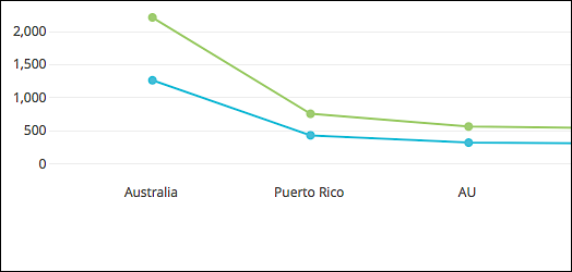
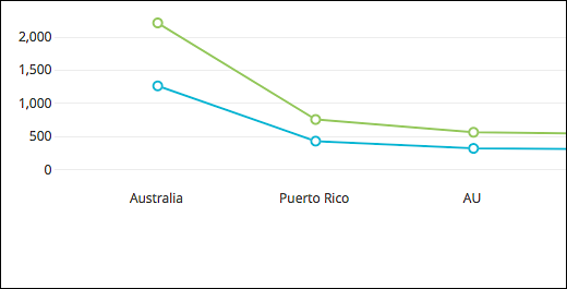
If you select Circle (outline) your chart will look similar to this:
Hide Legend
When set to On, the chart legend is displayed:
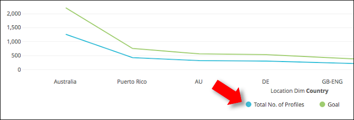
When set to Off, the chart legend is not displayed:

Limit Displayed Rows
When set to On, enables you to show (or to hide) a specific set of rows. When you set Limit Displayed Rows to On, you’ll see the following options:

The first list (Hide) specifies whether you want to hide or to show the designated rows. If you choose the hide the rows, all the rows in the table except the selected rows will be displayed. If you choose to show the rows, only the selected rows will be displayed.
To specify the rows, start by using the second list (First) to determine if you want to show or hide the First X number of rows or the Last X number of rows in the table. (You cannot show or hide rows found in middle of the table; for example, you can’t hide rows 25-to-50.) After making your selection then, in the Rows field, enter the number of rows to be displayed or hidden. For example, here we’ve chosen to show the first 8 rows in the table:

If the original visualization looked like this:

The modified visualization looks like this:

The Series tab
Configuration options for individual data series.
Colors
Enables you to change the color scheme applied to the visualization. For example, here’s a line chart using the default color scheme, Looker Classic:

And here’s that same chart with the Mixed Neutrals color scheme applied:

Show Full Field Name
When set to On, the complete field name (including the name of the Explore) is displayed in the column header:

When set to Off, only the field name is displayed:

Customizations
Modifies each series displayed in the chart. Allowed values are:
-
Color. To change the color of a line, click the Color icon and then, from the dropdown menu, click a new color:
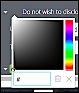
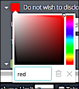
If you have a specific color in mind, you can type the hex value or the CSS color name of that color in the color field:
-
Label. By default, each series in the chart uses the underlying value as its label:

However, you can change the label for any series by clicking the arrow next to the series name and then typing a new name in the Label field:

That changes the label as displayed in the visualization:

-
Type. Specifies the type of chart used by the visualization. Valid types are:
- Area
- Column
- Line
- Scatter
For example, suppose you start with a line chart:

If you set the Type to Scatter, the visualization will change accordingly:

If your visualization uses multiple data series you can apply a different type to each series. For example, one series could be displayed as a line chart and a second type could be displayed as a scatterplot.
The Values tab
Configuration options for individual data points.
Value Labels
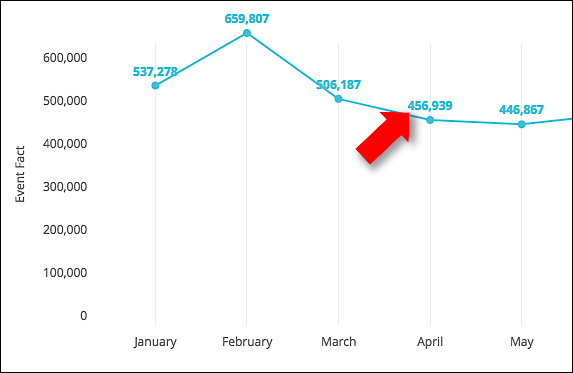
When set to On, displays the value of each data point in the chart:
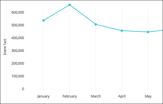
When set to Off value labels are not displayed:
Label Null Columns
When set to On, value labels are displayed for null data points. When set to Off, labels are not displayed for null values:
Value Colors
Specifies a different color for value labels (by default, value labels use the same color as the underlying series). For example:

The value color can be set using an RGB hex value or a CSS color name. For example, this sets the value labels to red:

The chart will then look similar to this:

Font Size
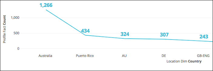
Specifies the font size for value labels. Typically, this is done by indicating a pixel size; for example, 14px sets the font size to 14 pixels (points):

This sample chart uses the default font size for labels:
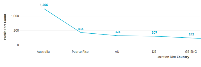
And this one uses labels with a font size of 18 pixels (18px):
Value Rotation
This option does not apply to line charts.
Value Format
Specifies how numeric values are displayed in the visualization. For example, if you want to display your value using a single decimal point, use this format:
#,###.0#
Customer Insights uses Microsoft Excel-style formatting for specifying value formats. For more information, see Guidelines for using decimal places, spaces, colors, and conditions.
Value Density
Slider control that determines the number of value labels displayed in the chart. For example, this chart has the slider set all the way to the right, the maximum density:

The X tab
Configuration options for the X (horizontal) axis.
Scale Type
Determines how the X axis is configured and displayed. Allowed values are:
-
Automatic Based on Data. Customer Insights analyzes the underlying data and sets the X axis scale based on the data types.
-
Ordinal. The X axis is scaled to show evenly-spaced data points, regardless of the relative distance between those points.
-
Linear. The X axis is scaled to show numeric values. This option is available only if the underlying data is numeric-based.
-
Time. The X axis is plotted using datetime values. This option is available only if the underlying data is datetime-based.
Reverse Axis
Changes the direction of the X axis. For example, suppose you have a chart that looks like this:

If you set Reverse Axis to On, the chart will “flip,” with the first series becoming the last series, the second series becoming the next-to-last series, etc.:

Show Axis Name
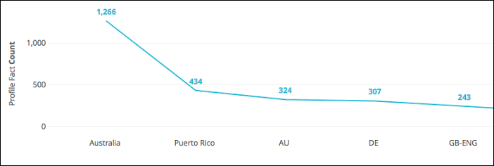
When set to On, the chart displays the name of the X axis:

When set to Off, the chart does not display the name of the X axis:
Custom Axis Name
Specifies a custom name for the X axis:

This name is displayed only if Show Axis Name is set to On.
Axis Value Labels
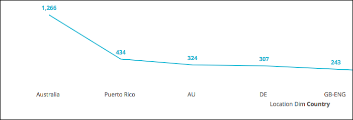
When set to On, labels for each series are shown on the X axis. When set to Off series labels are not displayed:
Gridlines
When set to On, vertical gridlines are shown on the chart:

When set to Off, vertical gridlines are not shown:

This option is available only if Axis Value Labels is set to On.
Label Rotation
Enables you to rotate X axis labels the specified number of degrees (-360 to 360). For example, this chart has Label Rotation set to 0 (the default value):

This chart has Label Rotation set to 45 degrees:

Time Label Format
Specifies how datetime values are displayed on the X axis. For example, to display a date as March 2018 uses this format:
%B %Y
For other datetime formatting options, see Time Formatting for Charts.
This option is available only if the Scale Type is set to Time.
Time Tick Count
Sets the approximate number of tick marks used in the chart; for example, setting Time Tick Count to 10 means the chart displays 10 evenly-spaced tick marks.
This option is available if the Scale Type is set to Time.
Padding Left
Specifies the amount of whitespace (in pixels) between the left side of the chart and the left side of the X axis. To set the padding, type in any integer value between 0 and 100. For example, this chart has a padding of 0:

And this one has a padding of 100:

Padding Right
Specifies the amount of whitespace (in pixels) between the right side of the chart and the right side of the X axis. To set the padding, type in any integer value between 0 and 100. For example, this chart has a padding of 0:

And this one has a padding of 100:

The Y tab
Configuration options for the Y (vertical) axis.
Gridlines
When set to On, horizontal gridlines are shown on the chart:

When set to Off, horizontal gridlines are not shown:

This option is available only if Axis Value Labels is set to On.
Reverse Axes
Toggles the position of the Y axis. By default, the Y axis shows 0 at the bottom of the chart and the upper bound of the data at the top of the chart:

When Reverse Axes is set to On, those positions switch: 0 is shown at the top, and the upper bound of the data is shown at the bottom. For example:

Left Axes / Right Axes
Enables you to configure the Y axes for a given chart. By default, charts that have more than one data series put each series on the left axis. In the chart properties, that looks like this:
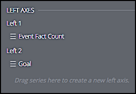
However, you can drag one or more measures from the Left Axes and drop it onto the Right Axes. When you do that, the chart redraws itself to show that measure’s label (and the appropriate set of tick marks) on the right side of the chart:

When you do this, you’ll also see separate configuration tabs for the two axes:
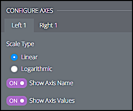
This means that you can configure the two axes in different ways. For example, you can hide the axis values for the right axis only:

Scale Type
Specifies how the Y axis is configured and displayed. Allowed values are:
-
Linear. Data is plotted using evenly-spaced intervals:

-
Logarithmic. Data is plotted using a logarithmic scale:

This option is best-used if your data set includes a set of extremely small values as well as a set of extremely large values. With more normalized data, this type of scale can be misleading, making the data points appear closer together than they really are.
Show Axis Name / Axis Name
When set to On, the chart displays the name of the X axis:

When set to Off, the chart does not display the name of the X axis:

To set the axis name, type the name in the Axis Name field.
Show Axis Values
When set to On, Y axis values are displayed:

When set to off, Y axis values are not displayed:

Unpin Axis From Zero
By default, the Y axis starts at 0:

By setting Unpin Axes From Zero to Yes, however, you cause the Y axis to begin at the lowest value in the data rather than at 0:

Y Axis Format
Specifies how numeric values are displayed along the Y axis. For example, if you want to display your value using a single decimal point, use this format:
#,###.0#
Customer Insights uses Microsoft Excel-style formatting for specifying value formats. For more information, see Guidelines for using decimal places, spaces, colors, and conditions.
Tick Density
Sets the number of “tick marks” (reference points) displayed on the axis. Two options are available to you:
- Default
- Custom
When set to Default, you chart might look similar to this:

When set to Custom, you’ll be given a slider control that lets you add or delete tick marks: sliding the control to the left decreases the number of tick marks, while sliding the control to the right increases the number of tick marks. For example, suppose you move the slider slightly to the right:
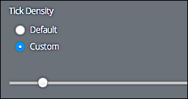
That gives you a chart (and tick marks) that look like this:

Minimum Value
Minimum value displayed on the Y axis. By default, the Y axis starts at 0:

However, by configuring the Minimum Value, you can have at the Y axis start anywhere. For example, here the Y axis start at 400:

Maximum Value
Maximum value displayed on the Y axis. By default, the Y axis configures itself to display the largest number in the dataset:

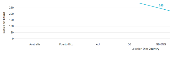
By setting the Maximum Value, however, you can limit the highest displayed number. For example, this graph sets the maximum displayed value to 250:
Reference Lines
Reference lines emphasize a specific value in your chart. For example, this chart includes a reference line that marks the monthly registration goals:

To add a reference line to a chart, click ****Add Reference Line. In turn, the following options will be available to you:
-
Type. Allowed values are:
- Line
- Range
- Line with Margins
-
Value. Specifies the value of the reference line. Options include:
- Median. Line is drawn at the median value in the dataset. The median value is the point that half the values are above and half the values are below.
- Average (mean). Line is drawn at the average value in the dataset.
- Maximum. Line is drawn at the largest value in the dataset.
- Minimum. Line is drawn at the smallest value in the dataset.
- Custom. Specifies the exact value where the reference line will be drawn.
-
Label. Specifies the label for the reference line. If left blank, the reference line uses its value as the label.
-
Label Position. Specifies the position of the label on the reference line. Allowed values are:
- Left
- Center
- Right
-
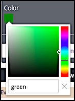
Color. Specifies a different color for the reference line (the default color is black). To change the line color, click the color icon:

The line color can be set using an RGB hex value or a CSS color name. For example, this sets the reference line to green:
-
Value Format. Specifies how numeric values are displayed in the visualization. For example, if you want to display your value using a single decimal point, use this format:
#,###.0#
Customer Insights uses Microsoft Excel-style formatting for specifying value formats. For more information, see Guidelines for using decimal places, spaces, colors, and conditions.
To delete a reference line, click the Delete button (X) located next to the reference line name:

Trend Line
Trend lines show trends in your data. For example, are user registrations going up? Are user account deactivations going down? Trend lines can help you answer questions like these. In the visualization, a trend line looks similar to this:

To add a trend line to your chart, click Add Trend Line. When you do that, the following options become available to you:
-
Trend Type. Specifies the type of trend line to use on the chart. Allowed values are:
- Linear. The trend line is a straight line that fits the data as closely as possible. Linear trend lines are typically used when the data rises or falls at a fairly consistent rate.
- Exponential. Treats data points on the Y axis as exponential values of data points on the X axis. This type of trend line, which cannot be used if the Y axis contains values less than or equal to 0, is typically used only if Y values rise or fall at very high rates.
- Logarithmic. The trend line plots Y values as logarithmic functions of the X values. This type of trend line, which cannot be used in any of the X values are less than or equal to 0, is typically used only if Y values increase or decrease very quickly and then level out.
- Moving Average. Data is repeatedly plotted as the average of all the previous data points. This type of trend line can often smooth out fluctuations in the data and present a clearer picture of the trend.
If you use the Moving Average trend line you can also specify a custom Period Which can be effectively any integer value). The Period specifies how many data points are included in each group being averaged. For example, to base your trend line on monthly changes, you can set the Period to 30 days (roughly one month).
If the Period is not defined then the moving average is calculated using all the previous data points.
-
Series Index. Specifies which series the trend line is applied to. By default, Customer Insights applies the trend line to first data series in your dataset. The first series has a series index of 1. To apply the trend line to the second data series, set Series Index to 2.
-
Show Label. When set to On, a label is attached to the trend line. When set to Off, only the line itself is displayed:

-
Label Type. Specifies the value of the trend line label.
- String. Applies a custom label to the trend line; simply type the label in the Label field. If you leave the Label field blank, the trend line uses set the label to the Trend Type (for example, Moving Avg for a trend line that uses a moving average).
- R^2. Displays the R^2 (coefficient of determination) label of the trend line. The R^2 label tells you well the trend line represents the data. Higher R^2 values are better than lower R^2 values: if the value is 0, the trend line does not match the data at all, and if the value is 1 the trend line perfectly matches the data.
- Equation. Displays the equation used to draw the trend line.
-
Label Position. Specifies the position of the label on the trend line. Allowed values are:
- Left. The label is displayed on the left side of the trend line.
- Center. The label is displayed on the right side of the trend line.
- Right. The label is displayed in the middle of the trend line.
-
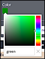
Color. Specifies a different color for the trend line (the default color is black). To change the line color, click the color icon:

The line color can be set using an RGB hex value or a CSS color name. For example, this sets the reference line to green:
-
Value Format. Specifies how numeric values are displayed in the visualization. For example, if you want to display your value using a single decimal point, use this format:
#,###.0#
Customer Insights uses Microsoft Excel-style formatting for specifying value formats. For more information, see Guidelines for using decimal places, spaces, colors, and conditions.
To delete a trend line, click the Delete button (X) located next to the trend line name:

Updated 7 days ago
