Funnel visualization
This article applies to the following Customer Insights roles: Developer

Typically used to show the reduction in data from one phase of a scenario to the next. For example, a funnel might track the number of people who log on to your web site vs. the number of people who register for your website vs. the number of people who verify their email addresses vs. the number of people who then log on to the web site for the first time.
Funnel charts are composed of a single set of numbers. If your dataset includes multiple columns, the funnel chart will use the values found in the first column. If you want to chart a different set of values, rearrange the order of your columns.
In this article:
- Customizing the Visualization
- The Axes Tab
- The Bars Tab
- The Labels Tab
Customizing the visualization
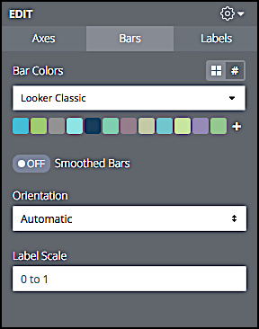
To customize the funnel visualization (label the axes, change bar colors, “smooth” bar transitions, etc.), click Edit to display the parameters menu:

Each of the tabs on this menu, and each configuration option found on these tabs, is detailed in the next few sections of this documentation.
The Axes tab
Options for labeling the left and right axes.
Label Left Axis
When set to On, displays a label on the left side of the chart (a field will appear where you can type the label name). For example:

Label Right Axis
When set to On, displays a label on the right side of the chart (a field will appear where you can type the label name). For example:

The Bars tab
Configuration options for the value bars.
Bar Colors
Enables you to apply a custom color scheme to the chart. For example, here’s a chart that uses the default color scheme, Looker Classic:

And here’s that same chart with the Mixed Neutrals color scheme applied:

Smoothed Bars
By default, a funnel chart looks similar to this:

When Smoothed Bars is set to On, the chart looks like the following:

Orientation
Specifies where the used to draw the chart comes from. Allowed values are:
-
Automatic. Customer Insights examines table rows and columns, and draws the chart based on which entity (rows or columns) contains the most data points.
-
Data in Rows. The data comes from table rows.
-
Data in Columns. The data comes from table columns.
Label Scale
Specifies the relative size of the value labels shown on chart bars; you can enter any decimal value between 0 and 1, inclusive. For example, this chart has a label scale of .1:

And this one has a label scale of .9:

The Labels tab
Configuration options for value labels.
Label Position
Specifies where data labels are displayed. Allowed values are:
- Left. Data labels are displayed on the left side of the chart.
- Inline. Data labels are displayed on the chart bars.
- Right. Data labels are displayed on the right side of the chart.
- Hidden. Data labels are not displayed.
For example, this chart displays data labels on the Left:

And this one displays data labels Inline:

Percent Type
Specifies how the percentage values are calculated. Allowed values are:
-
% of maximum value. The percentage is calculated by comparing the bar value to the largest value in the chart.
-
% of prior row. The percentage is calculated by comparing the bar’s value to the value of the previous bar.
Percent Position
Specifies where percentages are displayed. Allowed values are:
- Left. Percentages are displayed on the left side of the chart.
- Inline. Percentages are displayed on the chart bars.
- Right. Percentages are displayed on the right side of the chart.
- Hidden. Percentages are not displayed.
For example, this chart displays data labels Inline:

This chart does not display percentages at all (Percent Position is set to Hidden):

Value Position
Specifies where values are displayed. Allowed values are:
- Left. Values are displayed on the left side of the chart.
- Inline. Values are displayed on the chart bars.
- Right. Values are displayed on the right side of the chart.
- Hidden. Values labels are not displayed.
For example, this chart displays values on the right side:

And this chart displays values inline:

Color Label
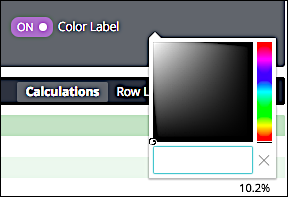
When set to On, enables you to specify a different color for the value labels (the default color is white). To select a different color, set Color Label to On and then click the color icon:
To change the color of the value labels, click the Color box and then, from the dropdown menu, click a new color:

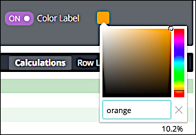
If you have a specific color in mind, you can type the hex value or CSS color name of that color in the color field:

In turn, the chart labels change color:

Updated 10 days ago
