Advanced field options
This reference contains information about the advanced options available when creating a new field:
Pre-check field by default
Indicates whether the checkbox option is automatically selected any time a form is opened.
The following field types support the Pre-check field by default option:
Submit blank field as null
When this option is enabled, then any time the field is left blank the user profile attribute is set to a null value instead of an empty string (""). Although the difference might appear trivial (either way the user didn’t enter or select anything), null values and empty strings are treated differently when conducting a search: if you are searching for all the null values you won’t find empty string values, and vice-versa. Effectively, an empty string means this: the user doesn’t have a specified value (for example, the user doesn’t have a middle name). By comparison, a null value means this: we don’t know whether or not the user has a middle name.
You might also want to enable this option if you are working with a unique field. With unique fields, multiple fields can be set to null values; however, only one field can be set to an empty string. That’s because, technically, an empty string is a value and, with a unique field, only one user can have an empty string as a value.
The following field types support the Submit blank field as null option:
- Checkbox field
- Date select field
- Email field
- Hidden field
- Password field
- Radio buttons field
- Select menu field
- Text input field
- Text area field
Ignore updates submitted to this field
Any changes made to this field are not saved to the user profile. Enabling this option allows you to display information from the user’s profile while not giving the user the opportunity to change that information.
The following field types support the Ignore updates submitted to this field option:
- Checkbox field
- Date select field
- Email field
- Hidden field
- Password field
- Radio buttons field
- Select menu field
- Text input field
- Text area field
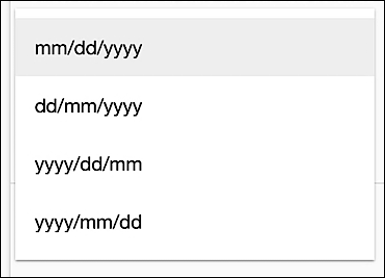
Date Format

Specifies the format to be used when entering date values into the field. For example, if you select yyyy/mm/dd then the date September 3, 2020 must be entered like this:
2019/09/0
The following field types support the Date Format option:
Start Year
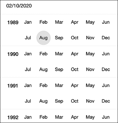
Specifies the earliest year that appears in the dateselect control. For example, if you set the Start Year to 1989 then 1989 will be the first available year:

That means that, in this case, you won’t be able to select an event (such as a birthday) that took place in 1988 or earlier.
The following field types support the Start Year option:
End Year
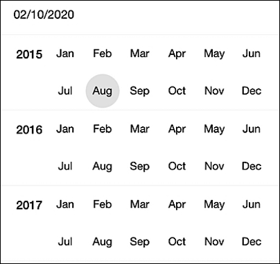
Specifies the latest year that appears in the dateselect control. For example, if you set the End Year to 2017 then 2017 will be the last available year:

In this case, you won’t be able to select an event (such as a birthday) that took place in 2017 or later.
The following field types support the End Year option:
Placeholder Text
Provides a “hint” as to the type of data that can be entered into a field. For example, here the word Password appears in the field; the placeholder then disappears as soon as you click in the field:

The following field types support the Placeholder Text option:
Pre-populate with data from identity provider
When using social login (i.e., when logging on with an account from a social login identity provider such as Facebook or Twitter), this option indicates the name of the social login attribute that populates the field on a registration form. For example, if the user’s first name is returned from the social login provider as firstName, then the Pre-populate with data from identity provider option will look like this:

In turn, when the user goes to the registration form, his or her first name will already be filled in.
The following field types support the Pre-populate with data from identity provider option:
Default Value
Value to be assigned, by default, to the associated user profile attribute. If the user provides an alternate value for the field then the alternate value is assigned to the user profile attribute. If an alternate value is not supplied then the default value is assigned to the attribute.
The following field types support the Default Value option:
Configure Options
Defines the set of values that users can select from.
The following field types support the Configure Options option:
Value
Value to be associated in the flow with the locale-specific version of the string. For example:

In the preceding example, any time the translatable string appears on a screen the text value For more information, click here. will be displayed.
The following field types support the Value option:
Label
UI text that identifies the field. For example, in the following Hosted Login screenshot the field label is Desired Password, and the actual field name (which is not displayed onscreen) is newPassword:

The following field types support the Label option:
Updated 24 days ago
