Sign-In screen (v1) CSS
Looking for the Hosted Login v2 version of this screen? Then see Sign-In screen v2.
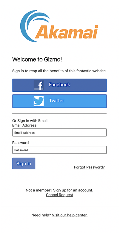
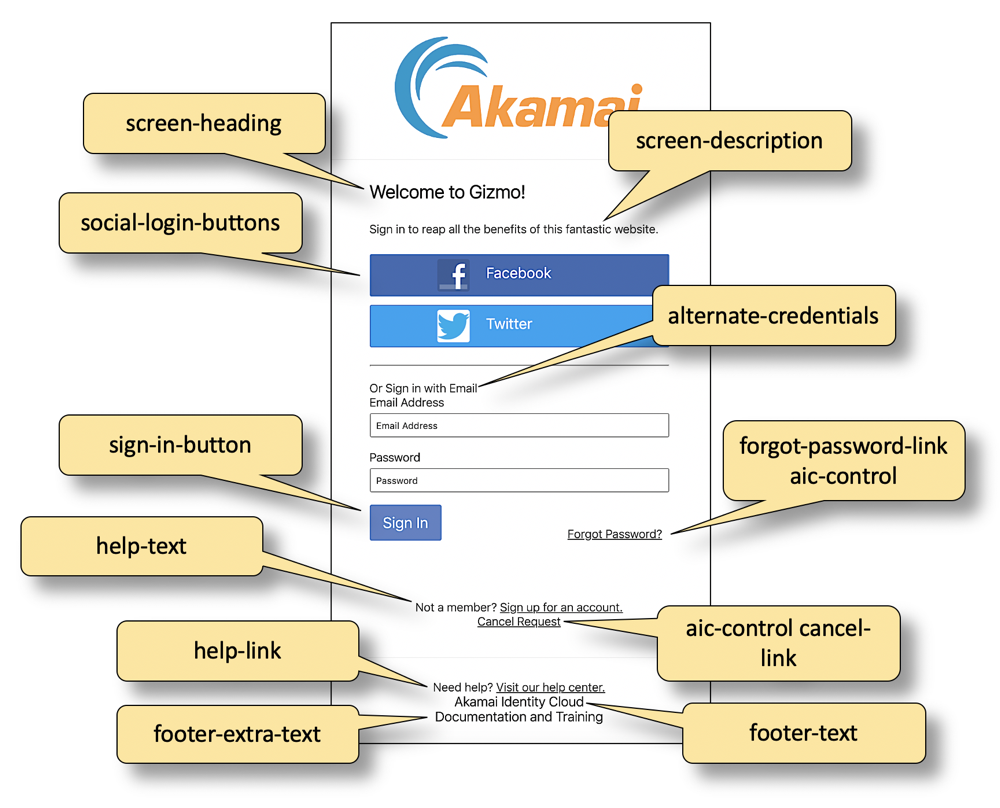
This screen is the starting point for user logins and registrations. By default, this is the first screen that appears when a user clicks a link for logging on to or registering with a site.
Login page HTML
To help you put the CSS classes in context, the following snippet shows the HTML markup used to define the screen. To view the latest HTML for a screen, right-click a blank spot on your Hosted Login login page, click View Page Source, then search for the screen name.
<div id="signIn" class="screen">
 <div class="auth-screen content-wrapper">
   <h1 class="screen-heading">{* textSignInScreenHeading *}</h1>
   <p class="screen-description">{* textSignInScreenSubHeading *}</p>
   <div class="social-signin">
     <div class="social-login-buttons"></div>
   </div>
   <hr>
   <span class="alternate-credentials">{* textSignInAlternativeCredentials *}</span>
   <div class="traditional-signin">
     {* #signInForm *}
       {* signInEmailAddress *}
       {* currentPassword *}
       <div class="form-action-buttons">
         <button type="submit" class="sign-in-button">{* textSignIn *}</button>
         <a href="#" class="forgot-password-link aic-control" data-render-screen="resetPasswordRequest">{* textForgotPassword *}</a>
         </div>
     {* /signInForm *}
   </div>
 </div>
 <div class="additional-actions-container">
   <div class="content-wrapper">
     <span class="help-text">{* textNeedAnAccount *}<a href="#" class="aic-control" data-render-screen="traditionalRegistration">{* textSignUp *}</a></span>
     <span class="help-text"><a href="#" class="aic-control cancel-link" data-action="cancel">{* textCancelRequest *}</a></span>
   </div>
 </div>
 <div class="footer-container">
   <div class="content-wrapper">
       <span class="help-link">{* textNeedHelp *}{* linkHelp *}</span>
       <div class="footer-text">
       {* textFooter *}
       </div>
       <div class="footer-extra-text">
       {* textFooterExtra *}
       </div>
   </div>
</div>
</div>
CSS classes used on this screen
The following table lists all the CSS classes used on this screen; the table also includes the default CSS specified for each class. Note that some classes, such as footer-text, aren't defined in the base.css file.
| CSS Class | Default CSS |
|---|---|
| additional-actions-container | .additional-actions-container {<br/> padding: 25px; <br/> text-align:center <br/>} |
| aic-control cancel-link | .aic-control {<br/> cursor:pointer <br/>} .cancel-link {<br/> display: block; <br/> margin-bottom:10px <br/>} |
| aic-control | .aic-control {<br/> cursor:pointer <br/>} |
| alternate-credentials | .alternative-credentials {<br/> display: block; <br/> font-weight: bold; <br/> margin-bottom:15px <br/>} |
| auth-screen content-wrappe | .auth-screen.content-wrapper {<br/> max-width:500px <br/>} |
| content-wrapper | content-wrapper {<br/> background-color: #fff; <br/> box-shadow:1px 1px 5px 2px rgba(0, 0, 0, .1) <br/>} |
| footer-container | .footer-container {<br/> padding: 25px; <br/> border-top: 1px solid #f2f2f2; <br/> text-align:center <br/>} |
| footer-extra-tex | |
| footer-text | |
| forgot-password-link-aic-control word-link aic-control | .aic-control {<br/> cursor:pointer <br/>} .forgot-password-link {<br/> position: absolute; <br/> right: 8px; <br/> bottom:0 <br/>} |
| form-action-buttons | .form-action-buttons {<br/> margin:0 -10px <br/>} |
| help-link | |
| help-text | |
| screen | .screen {<br/> min-width:460px <br/>} |
| screen-description | |
| screen-heading | .screen-heading {<br/> margin-top:0 <br/>} |
| sign-in-button | |
| social-login-buttons | |
| social-signin | |
| traditional-signin | .traditional-signin {<br/> position:relative <br/>} |
CSS classes mapped to UI elements
The following graphic maps CSS classes to the more-visible UI elements used in the screen: