Metrics dashboards
Metrics dashboards provide visual representations of the numerical measurements collected from a cloud service. Dashboards help you understand how a service is performing over time—for example, how much capacity it uses, how quickly it responds, or how much work it's handling. Dashboards make it easy to identify trends, compare current behavior with past patterns, and quickly detect when something isn't operating as expected.
Supported servicesMetrics are currently available in limited availability for Databases, Object Storage, and NodeBalancers. Support for additional services is planned for future releases.
Centralized vs. entity-level dashboards
You can view metrics in Cloud Manager using centralized dashboards or entity-level dashboards, depending on the scope of the data you want to explore.
Centralized dashboards aggregate metrics from multiple entities of the same service type and present them in a unified view. They help you compare performance across resources, identify patterns, and understand overall service behavior. To access centralized dashboards, navigate to Monitor > Metrics in Cloud Manager.
Entity-level dashboards display metrics for a single entity within a service, such as a specific database cluster. They help you understand the individual performance and behavior of that entity. To view an entity-level dashboard, open an entity's details page and look for the option to view Metrics.
When used together, centralized and entity-level dashboards provide both a high-level view of service behavior, and deeper insight into individual entities.
NodeBalancers metrics dashboardsCurrently, only the centralized NodeBalancers dashboard accessed from the Metrics page of Cloud Manager uses Akamai Cloud Pulse metrics. Entity-level dashboards accessed from the NodeBalancers section of Cloud Manager continue to display legacy graphs.
Dashboard components
Metrics dashboards are organized into two main areas:
- Configuration controls enable you to set the dashboard, time range, filters, and grouping options
- Widgets. display metrics visually based on your selections
After you apply your settings, the selected dashboard displays widgets containing the corresponding metrics data.
Configuration controls
Dashboard
Select the dashboard you want to view from the dropdown list. Dashboards are organized by service. A service can have multiple dashboards, each highlighting a different types of information, such as performance or resource usage. Each dashboard contains a set of widgets focused on related metrics.
Start and end date
Select a start and end date to define the period for the metrics display. Clicking either date field opens a calendar with optional preset ranges, such as Last hour or Last 30 days. You can query up to 31 days of data at a time. The dashboard automatically adjusts the granularity at which metrics data is aggregated based on the selected time range.
Filters
Filters help narrow down the list of available entities. The filters available depend on the service associated with the dashboard. You can select up to 10 entities from the filtered list for visualization.
Global Group By
Use Global Group By to split data into separate time series lines based on selected dimension values. Global Group By affects all widgets on the dashboard, so only dimensions supported by every widget can be selected. If multiple dimensions are selected, data is split according to those dimensions in the order selected. Widget-level groupings can be applied on top of the global grouping.
To use Global Group By, click the icon next to the Refresh icon beside the End Date field.
Widgets
Widgets visualize metrics data. They contain both graphical and tabular representations of the data. The number and types of widgets vary by service.
Widgets include the following components:
-
A chart showing how the metric values change over time. This chart makes it easy to identify trends, spikes, and patterns.
-
A summary table containing key values for the selected time range such as the maximum, average, and last observed values.
-
An Aggregation interval dropdown list that lets you select your preferred aggregation interval.
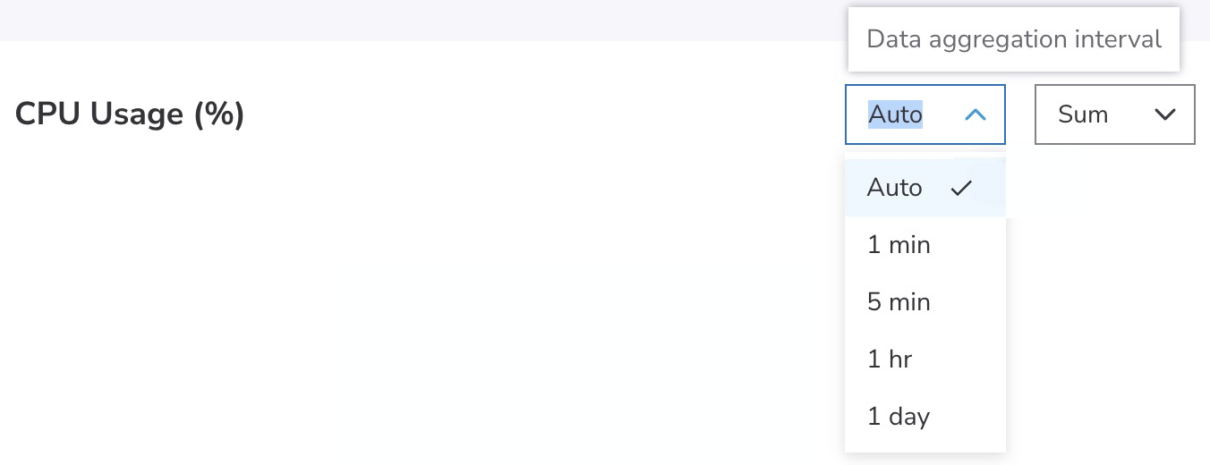
Metrics can be aggregated at intervals of 1 minute, 5 minutes, 1 hour, or 1 day. When set to Auto, the dashboard determines the appropriate interval based on the selected time range.
Time ranges map to the following granularities:
Time range Granularity Less than 24 hours 1 minute 24 hours to 7 days 5 minutes More than 7 days 1 hour -
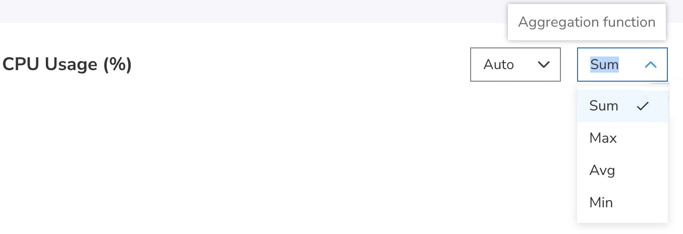
An Aggregation function dropdown list that lets you choose how metrics values are aggregated—for example, sum, maximum, minimum, or average.
You can change the width of the widget from 50% to 100%, or from 100% to 50% by clicking the resize icon.
Next steps
- Try using the centralized dashboard.
- Learn more about accessing entity-level dashboards.
- See descriptions of the metrics and dimensions for each service in the reference guides .
Updated about 2 months ago