What's new?
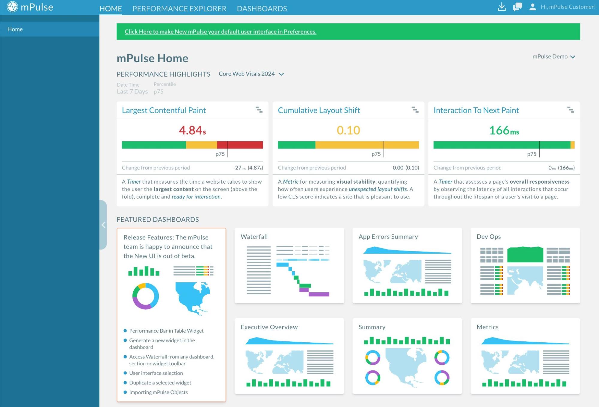
The redesigned mPulse user interface (UI) is now out of Beta. It puts the features you already know together with new developments, improvements, and refreshed visual design.
We combined all these elements to enhance the performance and usability of mPulse, and to make Real User Monitoring (RUM) data easier to find, access, and filter:

From now on, we’ll be referring to the previous interface as the Legacy UI, and the out-of-beta UI – the New UI. Going forward, the new UI is going to be called the mPulse UI.
New features
Apart from the features that can already be found in mPulse, the new interface offers visual and product improvements you can experience only after switching to the new UI.
The new mPulse UI is in constant development, and here’s a list of current features available exclusively in the new interface:
-
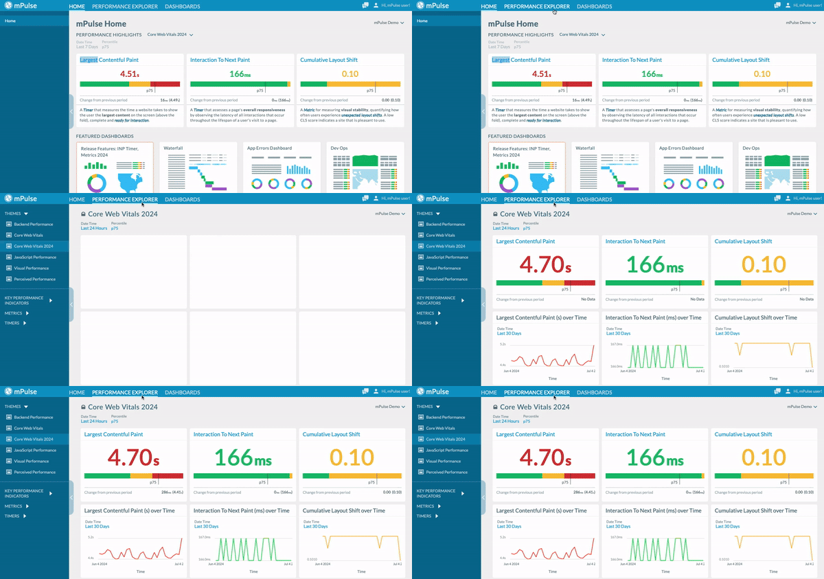
Performance Explorer. Gain valuable insights from the Performance Explorer platform, which allows you to understand and get detailed analytics on how your applications perform in real time.

-
Filter Templates. Configure and save groups of filters to get easy access to your data from dashboards, sections, and widgets in mPulse.
-
Selectors. Use specific Timers, Metrics, or Group By options to control matching-type inputs on the dashboard, section, or widget level.
-
Sections. Organize your dashboard into horizontal sections with titles, filters, selectors, and the application override feature.
-
Improved Data Visualisation Tools. The new mPulse UI features more interactive widgets for more dynamic data analysis.
Video tour
Get to know the new mPulse UI and watch this video tour:
Next steps
For steps on how to switch to the new UI, go back to the legacy UI, or just get around the new interface, see Get started.
Updated about 2 months ago
