Akamai observability
Filter bar
The filter bar is your main tool for narrowing the results displayed in the charts below. This helps you see just the type of traffic in which you’re interested. It also helps you drill down to the individual sample-level for troubleshooting.

There are curated fields so you can filter your results by what you need. Filter choices are also automatically populated with live data to make filter creation even faster. For instance, this example shows the most common values that TrafficPeak found in the Content Type field within your selected time range.
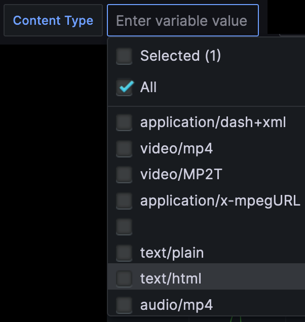
The queries behind the dynamic filter choices can be found in the dashboard’s Settings→Variables section by clicking the
icon in the top-right corner of the dashboard header.
Hits per status code
The Hits per status code graph gives you the most basic throughput information faceted by an HTTP response code sent to the end-user.
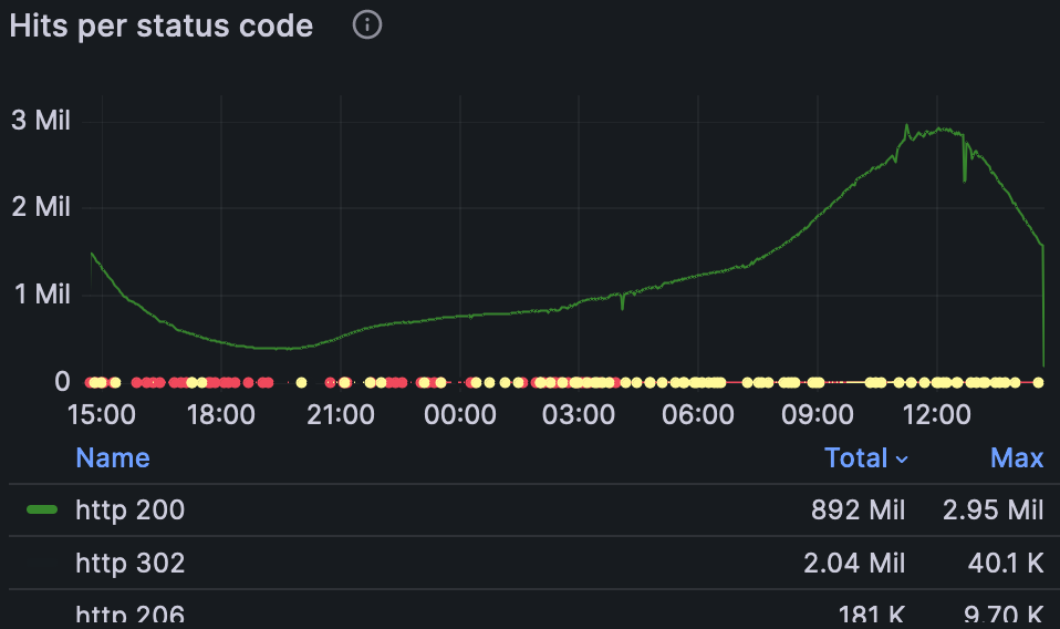
Click on each code in the table below to filter the chart above by just that response code. Use Shift-click to display more than one.
This widget uses the statusCode field from your Akamai DataStream 2 stream.
This is useful for showing spikes in specific response codes. For instance, if you see many HTTP 429 errors, you should review your Akamai rate limiting settings.
Cache Hit Ratio
This chart shows how well the Akamai CDN caches are performing, graphing the number of cached objects divided by the number of all objects served:
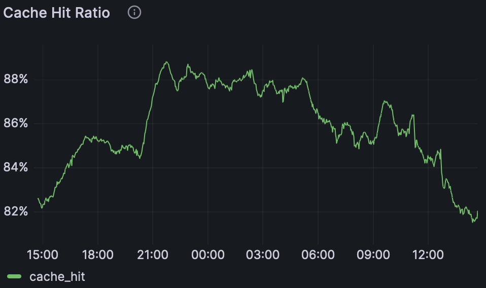
This percentage value is determined by the cacheStatus and count of requests.
(number of requests where `cacheStatus` = 1 )
 --------------------------------------------
         total number of requests
A possible use for this is exploring cache hit ratios over time for different paths requested. Combined with your knowledge of your web property, this can uncover opportunities to increase your Akamai caching effectiveness.
Throughput
In this chart, throughput is defined as bytes delivered by Akamai divided by the sum of transfer time.
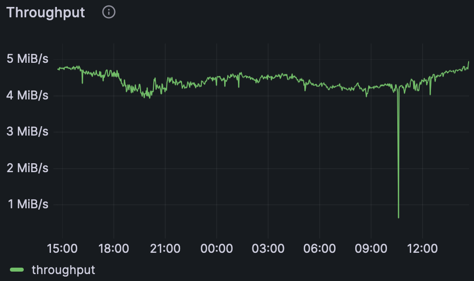
The throughput is determined by the DataStream 2 totalBytes and transferTimeMSec fields.
     sum(totalBytes)
--------------------------
sum(transferTimeMSec/1000)
This chart, when faceted by the dimensions in the filter bar, can show which properties are using the most bandwidth and contributing the most to your bandwidth charges.
Bytes Delivered
This will show actual bytes delivered from Akamai. It shows the sum of bytes served when divided up into equal time intervals.
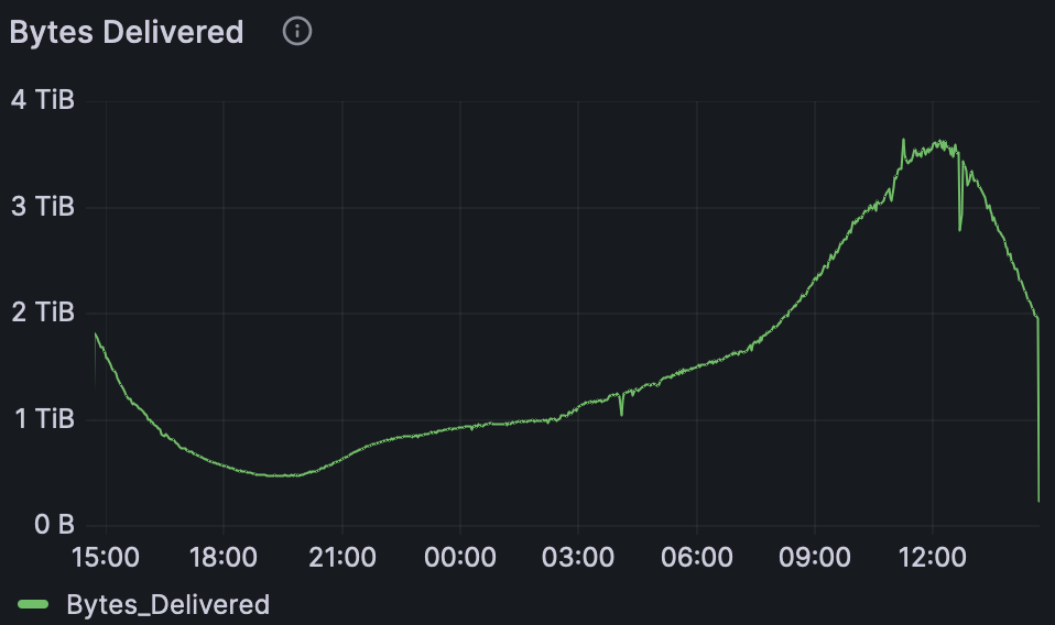
This is simply the totalBytes field reported from Akamai.
This chart is good for showing the periodicity of customer requests.
Top 50 Path
The top 50 paths are listed here, sorted by how many times they’ve been served during the dashboard’s selected time window.
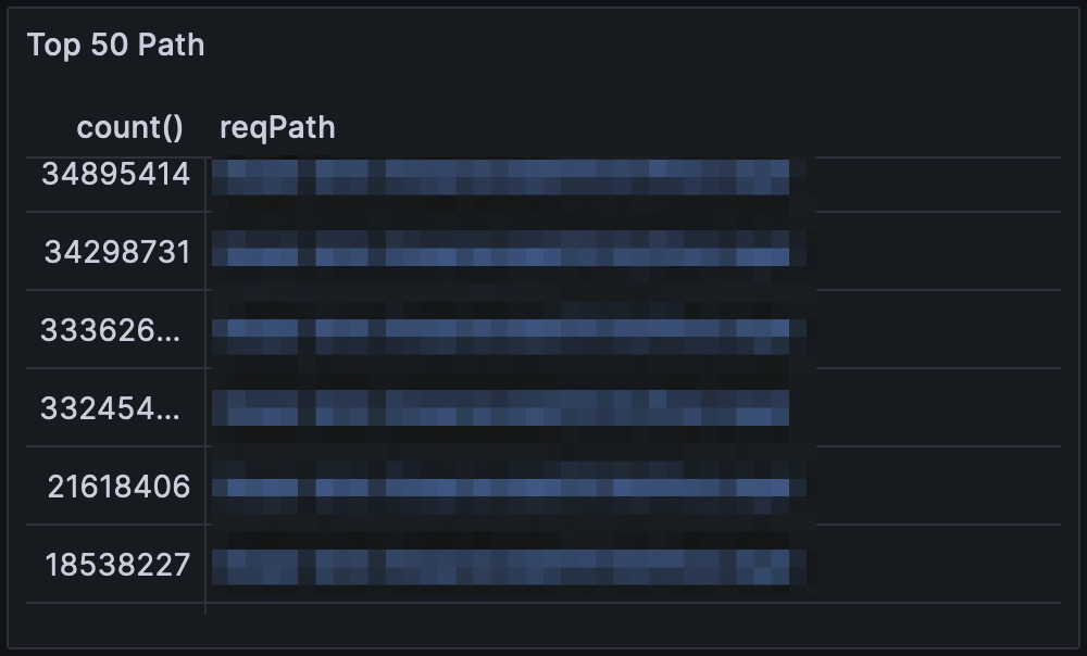
This chart uses the reqPath field from Akamai, counted and sorted.
This can help show targeted DDOS attacks or other automated processes that needlessly download web objects from your site.
Top 50 User Agent
The top 50 user agents requesting objects from your site are listed here, sorted by how many times each particular user agent string has been seen by Akamai.
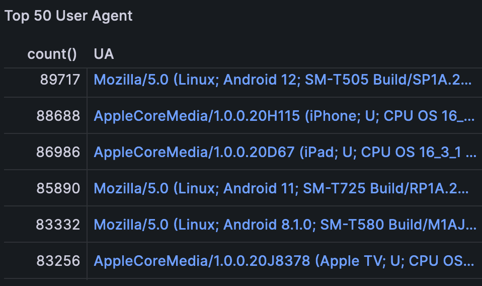
This chart uses the UA field from Akamai, counted and sorted.
This helps identify problematic user agents in the wild, including automated processes that may be using your bandwidth unnecessarily.
Request per Content Type
This pie graph shows the proportions of which type of content Akamai is serving your customers. The Value below is the count of objects of that type served during the dashboard’s current time window.
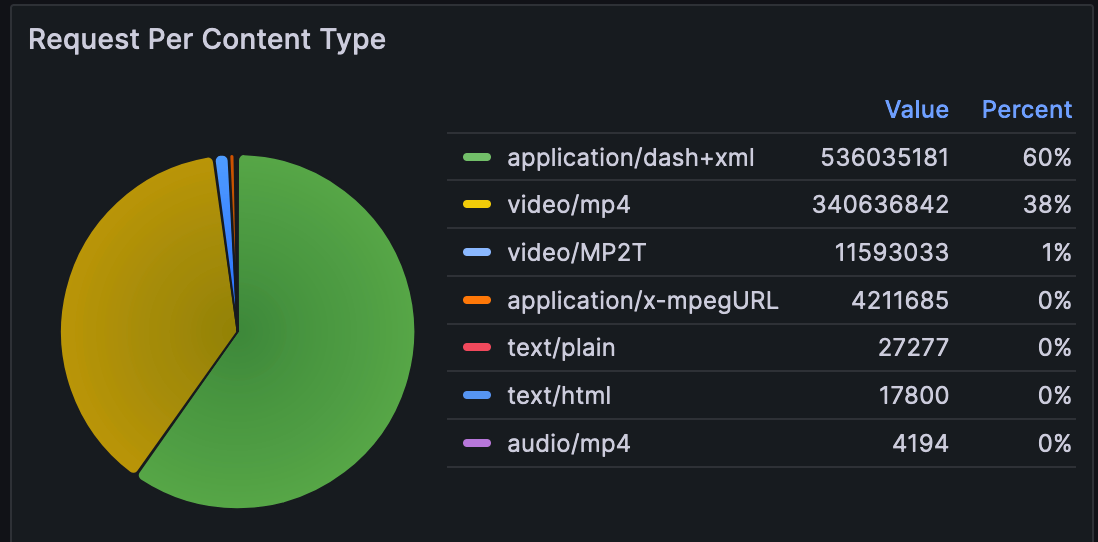
This chart uses Akamai’s rspContentType field. After the SQL counts and sorts by count, the Grafana piechart graph uses the legend definition below to display values and percentages:
"options": {
"legend": {
    "displayMode": "table",
    "placement": "right",
    "showLegend": true,
    "values": [
    "value",
    "percent"
    ]
},
Top 50 IP
The top 50 IP addresses requesting objects from Akamai are listed here, sorted by the count of objects.
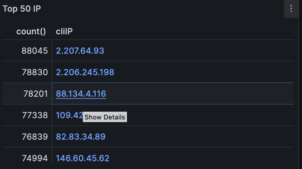
This table uses Akamai’s cliIP field.
This can be helpful for isolating specific service providers, corporate users, or bots residing at one address.
Edge TransferTime
The time in milliseconds from when the edge server is ready to send the first byte of the response to when the last byte reaches the kernel.
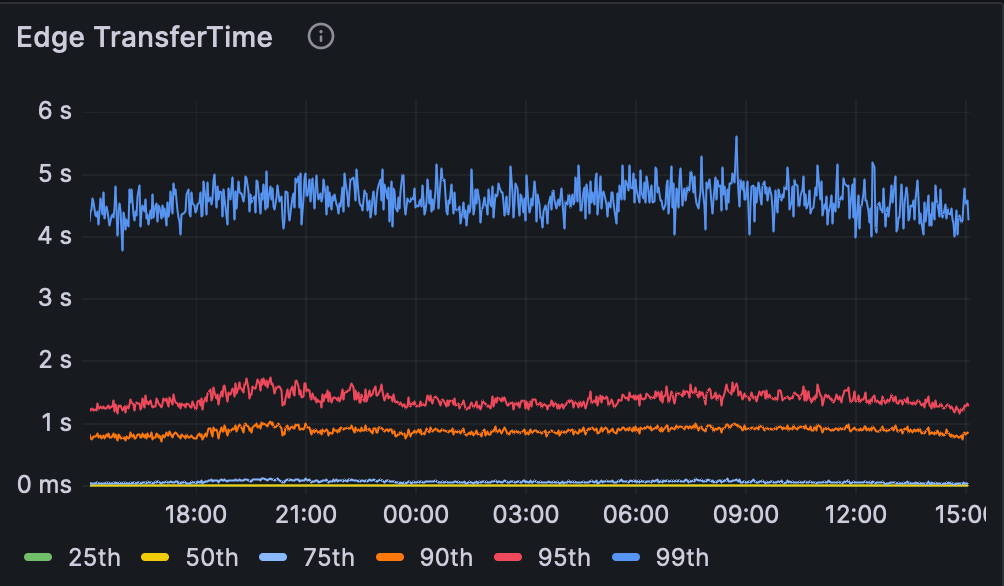
This chart uses the transferTimeMSec field from Akamai, combined with the SQL quantile function. This example shows how to display the 99th percentile.
quantile(0.99)(transferTimeMSec) as 99th
Edge Turn Around Time
This chart gives you an idea of the time it takes to process each request. More specifically, it’s the time between when Akamai received the last byte of the customer request to when it sent the first byte of the response.
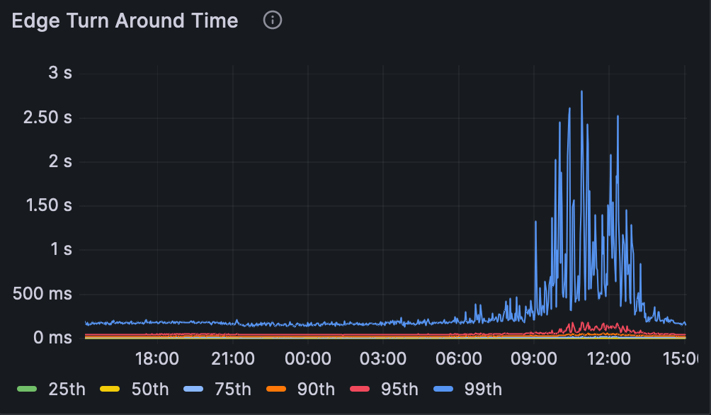
Akamai’s turnAroundTimeMSec field provides the values here, combined with the SQL quantile function. This example shows how to display the 95th percentile.
quantile(0.95)(turnAroundTimeMSec) as 95th
This is a good "smoke test" to show the presence of any problems with request processing and content delivery, whether it’s Akamai’s cache, a slow application server, or network problems. The 99th percentile is especially useful when you’re troubleshooting, highlighting the slowest responses from the CDN.
Updated 7 months ago